Mockups/new design discussions

It might be okay on shell dialogs, if we want to draw a distinction between them and GTK dialogs. However, I would like to stress again that extremely large ( > 10px or so) radii on the bottom corners of windows is a BAD IDEA and we shouldn’t look into do it. They don’t add anything to usability and will break many apps, requiring massive future maintenance overhead.

We should stop trying to address if we can do something until we clarify if we should.

3 Likes

Login Back Texture Test V29Nov17

Shattered is the best one, but I really don’t think any of them work. This just like the current Noise pattern in 17.10, at first boot I thought something was wrong with my graphics driver :wink:

Well, there are much more textures to try. I do think some of them have style - and the alternative is a pure background color since we cannot use wallpaper on the login screen… Its different from the actual login screen, but still use an Ubuntu way of styling. Also too fine and too distraction textures just don’t work at all.

Linux user :grin:

That’s something we maybe don’t need to pay attention^^

3 Likes

It would be great “overflow: hidden”
A border radius implies all child widgets with the same border-radius.
Maybe it’s possible to break the border with 2 pixels of border-radius :slight_smile: .

Hey guys!

I’m sitting with the Canonical design team currently in London, and FYI, I’ve tricked them to keep an eye on this thread (we are going to do some bug fixes in Ambiance while this new default theme evolved), please welcome @mpt, @Carla, @karlos and @ya-bo-ng!

13 Likes

Just wanted to tell as a FYI that I’m off until the end of year. Other Ubuntu contributors from the desktop team will keep an eye from time to time if you need anything.
Have a good break guys, but keep coming with plenty of great ideas! Let’s see what Christmas present I and the whole community will get from your awesome work next year! Cheers

10 Likes

So while the different lockscreen mockups look great, I noticed today that they don’t all translate over so well to multi-monitor setups. I think the safest bet for something that looks good on all setups would just be a repeating texture pattern the way Adwaita does it.

@didrocks Enjoy the time off. All the best. :slight_smile:

2 Likes

Main Desktop V04Dec17

I think the dots aren’t noticable enough as indicators as @merlijn-sebrechts says. I actually quite liked the gradient effect used in this mockup.

Running and focused programs use as a gradient (or just a semi-transparent white background color) as a highlight while running programs just have the dots:

running and focused

We also have to note that the dock size is configurable so it should be something that won’t be too hard to notice across smaller dock sizes.

Terminal, Calc and Elements

The rounded corners used in the calculator unfortunately aren’t feasible because of issues similar to rounding program windows. I like the colors used for the dark theme, but I think the widgets look a bit too material design? How about the look Suru was going for?

I really like the palette and shape of this dialog window, it looks brilliant and neat. Even if rounded corners (for all 4 corners) it’s not feasible, I’d like to see something similar at the end.

2 Likes

Yes, that is of course true. For now, it is just a test to see how it will look and I think this is something to get used to. Easier is to have the white layer because this is how the Dock works at the moment. But either way, it is important for me to shrink the app icons to a normal level, to give the dots more space, and to maybe shrink the Dock a little. We’re not heading for tablets and phones^^

Also a good point, they are quite the same than in a lot of other systems - the main reason for me was because we have the round orange dot as a repeating and recognizable element.

I will have a long look at this design, I guess we can use it as input. Some elements are already formed like in our design and like in this design we maybe should think about having more colors than just orange :slight_smile:

The actual design propose is very dark in some situations (maximized window) so the next days I will try to make it more suitable for the general public. For now, I like the overall direction, it seems we do need to get brighter and a little more conservative to be eye-friendly and good readable without looking to nerdish or gloomy. So we don’t have to work on two designs for now.

In the end, Ubuntu is for all people :smile:
Greetings!

Just to reiterate, having 4 rounded corners is something that’s technically possible, but doesn’t make for a good user experience. At least with the large radii proposed so far. A more subtle rounding (4-6px) would probably be okay, but the padding requirements with the hugely rounded corners don’t work on a user-experience level.

3 Likes

oops, I actually meant “*I like the palette and shapeS of this dialog window”. I wasn’t focused on the rounded corners only, but on the other widgets as well. I understood the reason behind “better not 4 too rounded corners” :slight_smile:

Does this mean that we’ll be keeping box-shadows or scrapping them? Because if we’re keeping borders, I’d like to revisit the raised button effect seen in this mockup. Without the top highlight and some alterations it could fit in well with Suru elements.

raised_buttons

button { background: #e5e5e5; border-color: #e0e0e0; border-bottom-color: #d0d0d0; border-width: 1px 1px 2px 1px; }

4 Likes

I think It’s the best solution, I prefer (box-shadows) but this is the problem with Firefox

1 Like

I’m testing out light dialog windows for the shell. I made the volume slider use light colors for some time but I changed it back since it seemed incoherent. I tried making the buttons look like normal buttons as seen here, but since modal dialog buttons are centered aligned it just looked kind of strange.

Testing will be annoying since looking glass is a little limited (or maybe I’m using it wrong) in that you can only really inspect elements that are always on screen like the top panel and dash. There are some dialog windows that I know will need some changes but these will basically need to be made blindly since you can’t force a prompt AFAIK. i.e “.audio-device-selection-dialog”.

This is all in an experiments branch until it seems doable. (I wish there was a way to get rid of the vignette)


9 Likes

Hey there,

I still have no visible change on the top-panel and so on (why is that still?), but for now, I have some thoughts:

  • Transparency on window decorations maybe too much
  • Window min/max is good, the close button X seems not to be centered and try to give them more clickable space without making them bigger. I would suggest shrinking the orange circle a little, but still be clickable outside the circle - if possible. Also bright hover.
  • Hover on buttons on a dark background should not be dark, but bright. The dark is just not visible
  • Also breadcrumbs in “Files” are still too dark
  • Vertical separator line between in the window decorations needs also to be bright
  • The green font in the terminal is hard to read - not enough contrast between the grey and green
  • The button design is already quite nice, maybe we can manage to make it look a little more like a shadow then like a 3D button? This is so Win95^^
  • Sometimes (like in settings) there is a grey area behind the adjustment/buttons, we should make it bright to not make the text and buttons disappear
  • The text on the desktop is grey?
  • When a window is not in focus and there is a switch (the new green ones), the word “ON” appears.
  • Window decorations not in focus maybe need also to get more bright for better visible separation

Also, I hope we have more time after the Christmas stress, there is still so much to do :slight_smile:
Really want to start adjusting the dock^^

@merlijn-sebrechts why did you delete the icons PPA post?

Power Off - the red background is a little frightening, like something bad will happen when clicked. Also about the window background - maybe we have to test if we should stick with the dark color to fit the design, or if the light background fits in.

Thanks to all, I’m glad that we could set everything up before Christmas :slight_smile:

And @godlyranchdressing thanks for trying on my “Finding Ubuntu” concept^^

Keep up the good work!
Stefan

2 Likes

Yeah, any background lighter than #303030 and the transparency value we’re going with becomes too much (especially against GTK2 apps which have no backdrop state to make their windows less noticeable behind the headerbar). The transparency will need to be decreased (or dropped entirely) unless we’re open to darkening the headerbar again and finding a solution to the visibility concerns.

We’ll need to use a background image for that, which I’m presently too lazy to make. The button can be 30x30 but a 20x20 (example numbers) background image that acts like the hover state will make it look smaller. I think maybe 24x24 for the button target would be good, if we make it too large then the cursor will noticeably be outside of the button’s radius and that might look odd if we stick to circular buttons.

I never once thought of just making the headerbar elements lighter instead of darker. Wow.

I tried editing the terminal but it wouldn’t work for some reason. I was going with the old terminal colors instead of the new ones since we hadn’t discussed those yet and I’m not sure how color-blind friendly the newer colors might be. Maybe @merlijn-sebrechts can provide some input.

Maybe you or @madsrh can do some mockups for a new button design? I fixed the quirks of the 3D buttons but I worry that getting the desired result is too complicated. I just didn’t want to go with boring flat buttons since box-shadows are out. Also, the issue with Firefox is that it seems to crop the around buttons past a certain point so that’s why box shadows aren’t possible.

Those should be fixed, but the changes haven’t been merged yet.

@luxamman, I’m cherry-picking some stuff to comment on, I’l address everything when I have more time.

I still have no visible change on the top-panel and so on (why is that still?), but for now, I have some thoughts:

Aaron’s PR wasn’t merged yet because it had an issue causing the ubuntu button to not show. Aaron has fixed this now, and the new package is available from the repo. sudo apt update; sudo apt upgrade. You might need a restart to show the changes. Let me know if you don’t see any changes.

Note that the Ubuntu dock will look f*cked up, there is a workaround for that, I’ll write everything down in a nice little step-by-step tutorial one of the next few days.

why did you delete the icons PPA post?

Sam worries that he will get flooded with issues “outside of the focus of development” when the ppa gets made public. He prefers to wait until the icon theme is in a better state (at the moment some icons are literally a white squircle etc…). His response is written here: https://github.com/snwh/suru-icon-theme/issues/20

The ppa itself and the icon theme package will still be available, I just put a big warning on the description on launchpad and I won’t yet make it public beyond this team.

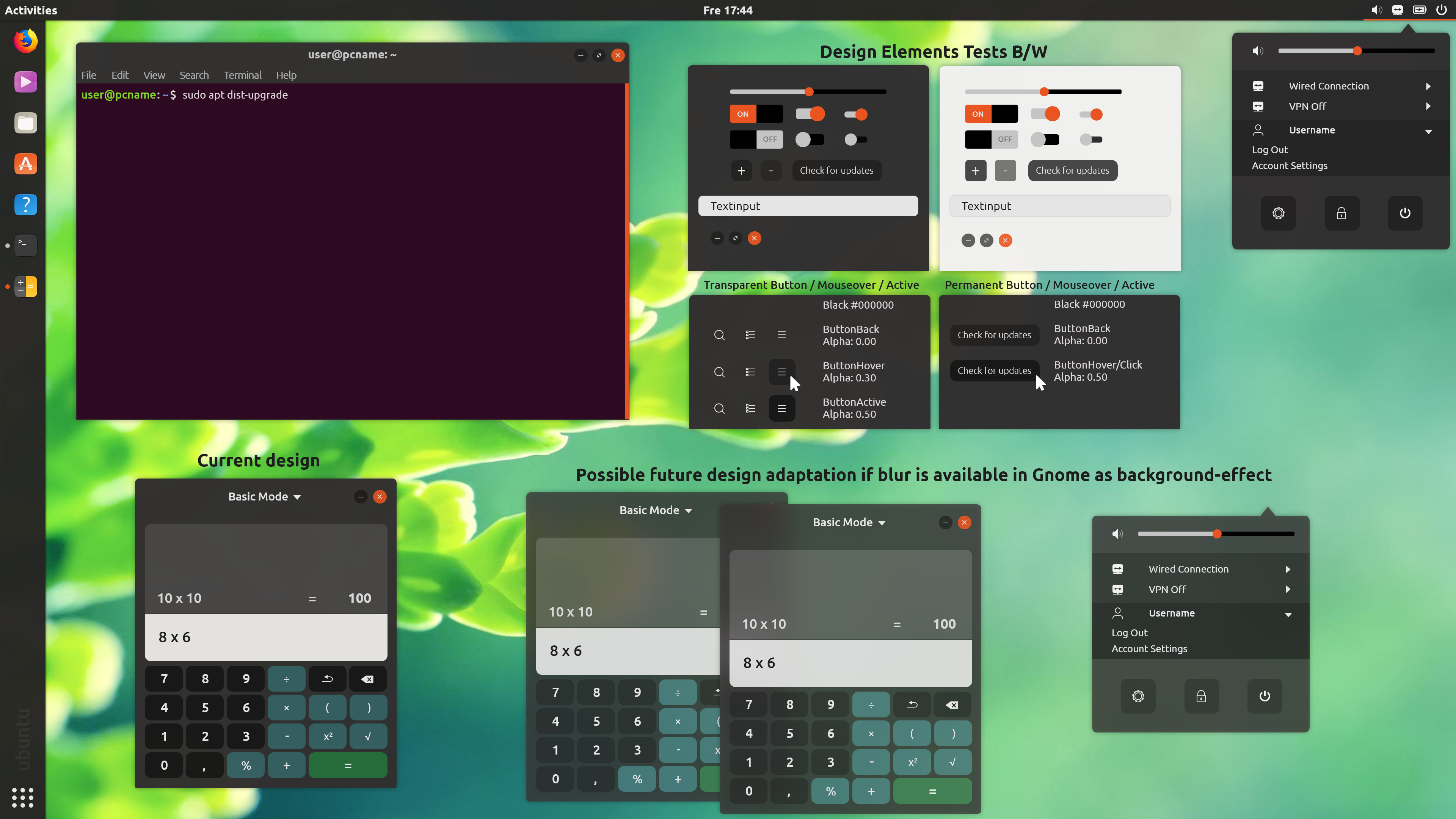
Also: Feel free to disregard my comments on the design, but look at that amazing half-squicle the Ubuntu logo is in, in the terminal screenshot. I really like it.

image

For some reason, sharp edges really don’t fit well with the suru design language. It’s the same with the message tray, the square corners are too sharp for Suru in my opinion.

image

Semi-related: it might be best to collect all the design posts/concepts of Suru into one place, to make it easy for people to “grasp” the design language and its roots (origami and the ubuntu font iirc).

I’ll do some research about the terminal colors, I’ll get back to you later. Ping me if it takes too long :slight_smile:

Funny story, I actually grabbed a lot of Suru design guidelines since I was worried that it’ll all be deleted after the announcement that Unity 8 was scrapped. :face_with_hand_over_mouth:

I can upload everything in a single archive once I organize it. It’s mostly a bunch of random screenshots of Unity 8 that I have to organize still.

4 Likes

That would be great, I was actually looking for images or installing a VM with unity for reference