Mockups/new design discussions

example
I like as well this grouping very much, it feels like a single thing, and we can see that arrows next to them will really impact this group alone. (still need to ensure the disabled state is clearly recognizable for them).

However, I wonder if the constrast is high enough between the background and text?

1 Like

Do we need one?
Anyway, inkstone is ok for me (if we need a separator)

1 Like

Do you think this is still an issue with the new headerbar color? The click-color is #1C1C1C, I can’t take a screenshoot with a darker color (:open_mouth: ), but I can hardly see the difference on my screen

It was @luxamman who pointed this out - I’m such a disaster with button, so I’ll just leave it to him :stuck_out_tongue_winking_eye:

Yes, they are still quite hard to spot. To me the current UI is kind of inconsistent:

  • In the Nautilus sidebar we use the orange rectangle for selected
  • In the pathbar it’s an orange line underneath
  • For buttons (search, grid,…) it’s a dark square
  • When I click ‘Activities’ in the topbar it’s highlighted to gray

:thinking:

In the quick mockup below (excuse lack of thouroughness), I’m actually leaning towards the orange line underneath or even the orange square solely because of consistency. The problem is that these options steal much focus, and so this might just be a really long way of saying, just make them a bit darker :upside_down_face:

4 Likes

Just a quick note: remember that there is the “suggested-action” button which needs a particular hilight (it’s green in the new theme, blue Adwaita). Something to consider while talkin about focus in the headerbar :slight_smile:

1 Like

Consider that, from a “functional” point of view, a pressed button is not selected (for which state we chose the orange). At this time, when a button is actually selected, it gets a orange border

image

2 Likes

I like the current way.

It might’ve been posted here already but I like what this blog says about the orange:

https://design.canonical.com/2016/05/colour-palette-updates/

It’s important for UX that keyboard navigation focus state “pops” because it can jump all over the place when you for example press tab.

1 Like

This also provides an explanation for how nautilus looks: The “hero item” in Nautilus is the selected item in the left sidebar. You can argue that the folder in the pathbar is the same item, so it also deserves to be orange.

The hero item in tweaks for example is the current category you’re on.

3 Likes

I fully agree! I also think that we should use dark(er) for buttons. It might seem like a controversial post, but I was merely pointing out the inconsistencys.

2 Likes

A quibble: The next section of that article describes blue as “the Ubuntu selected state colour”, as distinct from orange. I don’t know what “hero item” actually meant in that context, but it suggests that a selected item wasn’t one.

1 Like

Thanks for the clarification! I was on mobile, I honestly didn’t read that far :slight_smile:

I actually really like blue as the general “selection” color. I liked it on Ubuntu Phone and in Adwaita. However, I’m unsure what the current stance on it is, since it has changed a bit in the past few weeks and I’m not following the design discussions too closely.

I also like the “new” blue from the latest color scheme; it feels warm and “homely”.

https://docs.google.com/presentation/d/1FtHFW67ycl6uvxZqKIZwyinVyOuV9NxXDuJv1SwQ70k/edit#slide=id.g13b3c671fc_1_0

1 Like

I wonder whether that darker blue is a problem with dark backgrounds

It seems that the black bottom line is rendered bad on some screens

https://ubuntucommunity.s3-us-east-2.amazonaws.com/optimized/2X/c/c03871a24c91b771dcd39e002472ecf11ce1be4e_1_690x144.png

Now the path-bar is still under rework, so maybe this won’t be a problem anymore, but this might be useful to know as well :slight_smile:

This is replacing it with $slate (#5D5D5D)

image

2 Likes

I actually thought that we were reverting to this:

I don’t think the current design is working IMHO :worried:

4 Likes

Hey there,

since the button design is not consistent and has problems on the dark back, I stepped back again and overlooked some design and stuff we need to adopt (because of Gnome and so on). This is an overview of possible designs, after choosing what we like and what’s working I can work on defined mockups with the chosen design.

I also could not try all sorts of designs. Simply combine!

First the flat button design: (Not perfect visible on the PNG)
butnewline
The four states are flat, hover, clicked and focused (like when hitting tab).
The first row is like it is now, the dark is hardly visible. So the second row has the same color for hover and clicked, with an inner-shadow to make it look clicked. Row 3 and 4 are also with an orange border for feedback.
We should consider this as a working and visual better solution. Also, the jump from white hover to dark clicked is less consistent.


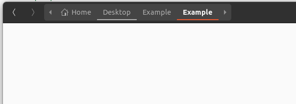
Like always, breadcrumbs say hello.
The actual design is like also mads said not working (but was worth a shot!).
Like the connected buttons, they should be connected somehow and they should have a similar look.
Like the address bar in a browser, I don’t mind if it is not completely flat - they have a certain meaning and task and IS an address bar in a way. And with the white clicked button design from above it’s more consistent.
buttons2
1: Flat, same backcolor, but repeating the Gnome surrounding buttons style
2: Like 1 but the clicked buttons also get’s an inner-shadow like on the other buttons.
3: Like 2, but only bottom line for focus and maybe little thinner like it is now because of the double feedback.
4: Only the clicked buttons feedback with the inner-shadow.
5: Flat with bottom border only, but then they need a separation between.


This kind of design is also adaptable to the power off window - with 4 or 1 border (focus and clicked):
poweroffnew

Or the Software Center:
softwarecenter


I don’t have time for perfect mockups (like squircle and colors, visual them in your mind^^) but this way around we’re adapting the Gnome style buttons and combining them with a better visuality like we have it now and the orange focus border(s) we use. And this brings more consistency and better usability thru the system (on dark back).

The buttons on white are still very different, but that’s also part of the deal when having a dark background. I tried also the inner-shadow effect, but this is a thing to try, mockups are not enough to see if it’s working. The orange color is also just a focus color - people will get used to it when using.

And yes, it is also a little compromise - maybe there is another consistent and working way. But to be consistend we need to make compromises here and there. Maybe it’s working in the live system too.

Overall - do you think this is a good way for you all?
Inner-shadow in connected buttons - or flat with a border only?
Other thought??

Let’s try to speed things up a bit to get faster decisions.
More stuff later… Stefan

3 Likes

Nice work Steffan :smiley:

Short reply here: I like 1,3 or 5

Would you suggest another Hangout session?

Awesome work Stefan!

Flat button design: I like 2 and 3. The second option might be less visible in some screens though.

Breadcrumbs: 3 and 5

Summing it up, for squared items I prefer borders, while I prefer the bottom border only in rectangular shapes.

1 Like

Nice work!

My preference:

  • flat button: 1 since the design of 3 doesn’t have a way to show “selected” status of a pressed-in button.
  • breadcrumbs: 3, although I would prefer the pressed in state to be the same color as flat button 1. Since a pressed in flat button and breadcrumb is in the same z-axis, they should have the same color shade imo.

Thanks for your input, I’m not sure if the always pressed status is working everywhere in a nice looking way, but only for clicking (like in power off) it should be fine. We’ll find out^^

I sum it up to this for now based on your answers and including my favorites (hope this is right):

I’m out for today, hope we’ll get all feedbacks until tomorrow.
Stefan

5 Likes