I’m in complete agreement with the suggestions that @madsrh has 
1 Like
Thanks,
I also created issues for:
- Checkboxes and radio buttons design change
- Click button color darker
- Switches smaller without inner shadow
+1 for lighter grey
About the dock - maybe we can solve some problems by changing the dock itself since it is a fork. @didrocks will know and maybe he can help us with it.
- The overall inner-shadow is not working for example with the square elements - so I would like to see the inner-shadow on the top only. Just for the separation of the top bar. Sometimes -10px works, maybe we can add a fixed element to the dock? This way it would look more like a glass-element but I still don’t want to lose the shadow on the top…
- The dark square is not very nice looking, the hiding mechanism is also working very strict:

Is there a possibility to soften this hiding mechanism a little? This is tricky, but maybe there is a solution to make something like a shadow but instead of a color, it add’s transparency to hide the icons. Ideas?
And again the points like months ago for @didrocks - I still would love to change the dock a little:
- Making icons smaller, less clumsy and more elegant. Also giving more space for the indicator points. The position would not be centered, but a little to the right.
- Indicator points are centered between the icon and the screen border, also a little bigger. In the actual system, they are never centered and sometimes overlapping the border.
- Giving the icon on the top a little more space to the top - the actual dock has more space between icons than between the top icon and the top bar.

Since the dock is a fork, this changes could bring an additional design bonus to fit the system and just look better. The icons are just tooo big IMHO…
Thanks to all!
3 Likes
On the dock. I read here that you discussed it a little bit about not being able to theme it while I was on holidays. Do you mind describing a little bit more the issue?
There is an option which we keep to false “org.gnome.shell.extensions.dash-to-dock apply-custom-theme”. I looked at the code, this only adds “dashtodock” class to the dock itself to differientate from the dash one, which could be used in the general Shell theme.
So, I would be in favor to do most of the changes in the themes (in term of maintainability), and if someone should be done in the theme and couldn’t, we talk to upstream about adding the correct class to support it. 
Am I missing anything?
That’s maybe the issue you were seeing: dashtodock has its own css file shipped in the theme (this is how “shrink” and others properties are different: they just change the class name and apply the new style thus). This css files is applied last for the theme, and it seems it overrides the general theme thus.
I would propose to remove this css file in our fork and just implement that in the general theme, wdyt? (/!\ it means I need to upload this modified dash to dock in the ppa and keep it up to date or find a clever way to change this on the per session stuff…).
It means that we will port all properties from stylesheet.css to the general theme, which is a better place for this particular use case IMHO (and let also other theme creators style it).
I’m not sure to get what you mean here. I don’t see any inner shadow between elements?
The dark square (I guess when you select an element) can surely be styled once the restriction above is lifted.
hiding mechanism: that’s indeed a little bit more tricky. However, it looks better on my ubuntu session than apparently for you, note the transparency + shadow. See the bottom and top icons:

The default is shrinked (from your screenshot, it’s not enabled apparently), so giving less space to icons. We can change default icon size (I always set them to 32px personnally). However, IIRC, the 48px default was selected based on user testing.
Indicator position, size and spacing should be able to be changed via css.
Same, should be doable with a :first-child css class.
So, it seems that overall, all requests can be changed without any code modifications, just ensuring the css file doesn’t override the shell theme, am I right?
As a first approach, we can directly patch the css file /usr/share/gnome-shell/extensions/ubuntu-dock@ubuntu.com/stylesheet.css if you want to ensure this is doable
1 Like
that’s the way! Open all the issues! The more the tickets the best we can organize our work and time
2 Likes
Ok, after some tests, it seems that the general css isn’t applied to extensions, or that at least, removing the stylesheet.css and implementing the same property in the general theme isn’t picked up (I tried first with !important before deciding to remove the stylesheet.css directly for this).
EDIT: I found a trick actually looking at the code.
It’s supposed to apply (in order of loading, first one can be overriden by later ones):
- general mode css (in
/usr/share, the theme you are hacking on) - extensions
stylesheet.css - extensions
mode_name.css(ubuntu-communitheme).
There is no way for!importantto take precedence.
In the case mode_name.css == stylesheet name (case for the ubuntu theme, not for the ubuntu-community-theme, so I need to test it), the trick is that an empty extension mode_name.css file will make the general mode css file taking precedence over the general extensions stylesheet.css! This is another option as well. But I think the cleanest way is to ship a mode_name.css file next to stylesheet.css in the extension.
2 Likes
I really like #2B2929.
- Change the pure orange for selections to a softer orange like in actual Ubuntu (16.04) to make the orange less dominating and the contrast flatter?
I do get that the current orange throws off the soft look we’re going for, but I prefer the current orange over a softer orange. How about using Silk (#CCC)?
- Checkboxes and radioboxes - we have two designs now - the one in “Files” an the one for example in “Tweaks”
This was taken from Suru. Adwaita uses a simplified check and radio in its menus as well. I’m not exactly sure why but I did come up with:
- Deal with the selection color “overwriting” the color of the checkboxes and radio buttons - we use gray instead of orange for selected menuitems now so we don’t have to consider this anymore

- Not have too much complication in menus with a lot of checkboxes and radio buttons (LibreOffice) - this is something we could consider since there’ll be a lot of solid green in menus if we do scrap the hollow variant in menus, something that will throw off the soft look we’re going for.
- Seems the green switches have an inner-shadow now - do we want that?
Checks, radios and buttons use shadows as well. Looking at it now the shadow is a bit too much though. Maybe 1px instead of the current 2px?

- Connected Buttons? Where are we heading? Have you tested possible designs?
I’ve been using the “hollow” concept - linked buttons have a border with no background. Unfortunately, an optical illusion comes into play and it makes everything look the same shade, especially thinner icons like the back-forward buttons. It looks much worse in this screenshot but it’s not much better in action. It’s cool and frustrating.

Still proposing the following on my end.

I’ve been updating the insensitive/backdrop states based on Ubuntu’s disabled state styling and path bar buttons opacity and it looks this now:

I was leaning towards A since B’s border colors are a little too faint.
Sure, it’s just that the tick is so thin for the checkboxes that making it smaller makes it look weird. I’ll try to find a nice balance.
The edges having a shadow is due to the blur effect. Too low of a blur effect and it doesn’t look like a shadow on top, but too much and the other edges of the dock start to take on the blur effect. That was before the lighter dock color though (current is #292929 or something close to that). I’ll experiment and see what works while also taking into account a more transparent panel.
2 Likes
It looks like #2B2929 got most of the love  (3 or 4 preferences against 1 for the others). I’m going to open a ticket and then push the change
+1
May be this also the reason of this?
1 Like
IF there must be a border around the entire bar, I would prefer your earlier version with a solid gray background:
5 Likes
That could work too, I guess. For that mockup path-bar I was going for a fake entry field look.
What about for the linked buttons?
- They need to be linked to avoid potential issues
- They need to look disabled when they’re disabled - why I think we should use a background color again
Are headerbars going to be the same color? And what are opinions on a separator between the top panel and application title/headerbar? I got the idea from one of the Canonical mockups. Inkstone is being used here for the separator.

1 Like
+1 for darker border. It fits well with the “physical” appearance of a button: It’s just a label, not a button so you can’t press it. Grey makes it look as if it’s a button that is pressed halfway in…
1 Like
I like the shadow as it is now, I like the non-flat aspects of the theme; it distinguishes us…
I think the issue with B is that the borders of the enabled buttons need to be a bit darker. I think that’s how it should be given the light source from the top: the edges of a button that are risen should be more pronounced than the edges of a button that is level (or a label).
For the linked buttons, I also like the approach of this pathbar the most:
(the shared lighter background)
I think depth doesn’t really work in the headerbar because the other elements in the headerbar are flat… Although the “rail” for the orange underline worked well imho.
1 Like

I like as well this grouping very much, it feels like a single thing, and we can see that arrows next to them will really impact this group alone. (still need to ensure the disabled state is clearly recognizable for them).
However, I wonder if the constrast is high enough between the background and text?
1 Like
Do we need one?
Anyway, inkstone is ok for me (if we need a separator)
1 Like
Do you think this is still an issue with the new headerbar color? The click-color is #1C1C1C, I can’t take a screenshoot with a darker color ( ), but I can hardly see the difference on my screen
It was @luxamman who pointed this out - I’m such a disaster with button, so I’ll just leave it to him 
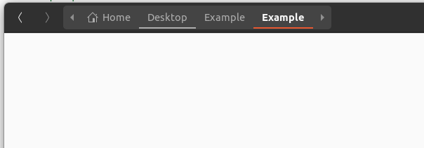
Yes, they are still quite hard to spot. To me the current UI is kind of inconsistent:
- In the Nautilus sidebar we use the orange rectangle for selected
- In the pathbar it’s an orange line underneath
- For buttons (search, grid,…) it’s a dark square
- When I click ‘Activities’ in the topbar it’s highlighted to gray
In the quick mockup below (excuse lack of thouroughness), I’m actually leaning towards the orange line underneath or even the orange square solely because of consistency. The problem is that these options steal much focus, and so this might just be a really long way of saying, just make them a bit darker 

4 Likes
Just a quick note: remember that there is the “suggested-action” button which needs a particular hilight (it’s green in the new theme, blue Adwaita). Something to consider while talkin about focus in the headerbar
1 Like
Consider that, from a “functional” point of view, a pressed button is not selected (for which state we chose the orange). At this time, when a button is actually selected, it gets a orange border

2 Likes
I like the current way.
It might’ve been posted here already but I like what this blog says about the orange:
https://design.canonical.com/2016/05/colour-palette-updates/
It’s important for UX that keyboard navigation focus state “pops” because it can jump all over the place when you for example press tab.
1 Like
This also provides an explanation for how nautilus looks: The “hero item” in Nautilus is the selected item in the left sidebar. You can argue that the folder in the pathbar is the same item, so it also deserves to be orange.
The hero item in tweaks for example is the current category you’re on.
3 Likes
I fully agree! I also think that we should use dark(er) for buttons. It might seem like a controversial post, but I was merely pointing out the inconsistencys.
2 Likes