Nautilus_V22Nov17_A - higher contrast

Nautilus_V22Nov17_B - lower contrast

Nautilus_V22Nov17_C - light headerbar
Nautilus_V22Nov17_A - higher contrast
Nautilus_V22Nov17_B - lower contrast
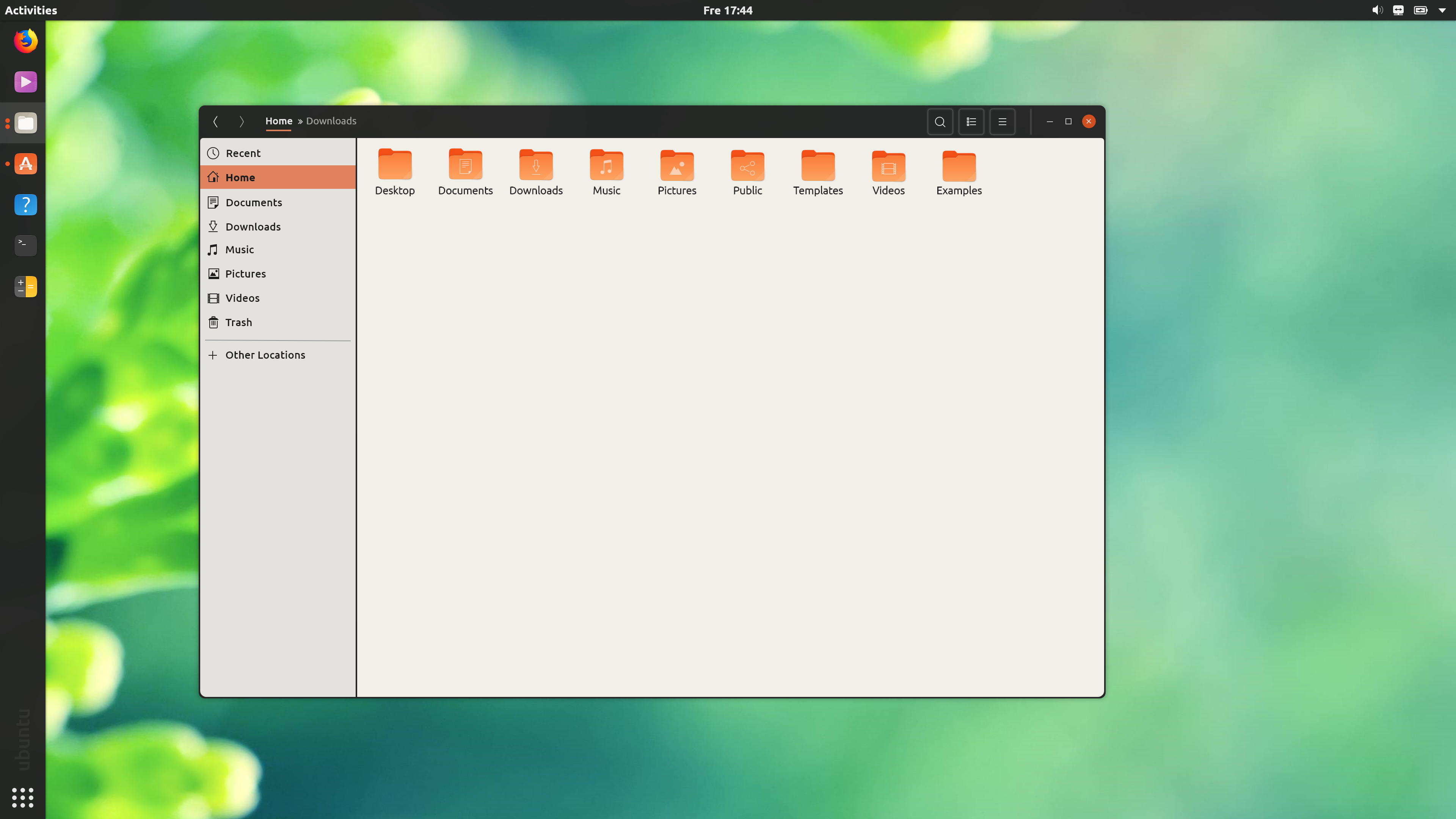
Nautilus_V22Nov17_C - light headerbar
Nautilus_V24Nov17 - (Pictures and Videos show the hover state for rows)
Nautilus_V25Nov17 - Light headerbar version of the above. Mimicking @wfpaisa’s raised buttons.

Widget Factory_V25Nov17
Files 26Nov17_Tabs
Giving tabs a try (but they ended up being too tall). See the hover effect here: https://youtu.be/reIYDywqAKA
Overall more focus on a basic theme and on what is actually possible, not on changing lot of stuff/details to get a whole new look.
Sleek and defined with a good overview with a bit of a “futuristic design” without getting lost in transparency. The rendering of fonts and lines are not good, unfortunately. Also (like proposed) changed the dark grey to #252525 to see how it works.
Login V27Nov17
Main Desktop V27Nov17
Files Window V27Nov17
Files Windows Overlap Test V27Nov17
Files maximized Window V27Nov17
Terminal & Calc Test V27Nov17
 )
)Based on your feedback, I updated the mockup from yesterday (V27Nov17) for a new feedback round.
Changes:
Login V29Nov17
Test with background texture (https://www.transparenttextures.com/light-sketch.html)
Main Desktop V28Nov17
Files Window V28Nov17
Files Windows Overlap Test V28Nov17
Files maximized Window V28Nov17
Terminal & Calc Test V28Nov17
Waiting for your feedback and change proposals! 
Please compare also the previous version.
Path Bar Button Focus States V1 - A
Path Bar Button Focus States V1 - B (normal buttons)
I created some example backgrounds with https://www.transparenttextures.com/ proposed from @godlyranchdressing and I guess we will find something that will fit the rest of the design 
Based on mid Canonical aubergine
Login Back Texture Test V29Nov17
Light Sketch
Shattered
Type
White Wall
Bright Squares
Something drastic, but also simple. Solid background with a gradient image overlaid.
Solid Login Screen - A Original #2c001el
Solid Login Screen - B Using #252525
I like the idea of @godlyranchdressing with a very simple way of presenting the login screen, also @madsrh login looks nice, but the white window is working against the dark theme we are heading for.
And for now we should not change the Gnome window arrangement, only theming.
I tried to test a kind of “focus” with layers:
Layers from top:
I found the following image from the Unity 8 source package:
I did some simple rotating and flipping and came out with this for the login screen:
Ideally the background color would be the original #2c001e, but the source files are all jpg/png so there’s no way to just overlay the image on top of a solid color and produce the same origami fold effect. Unless someone is willing to step up to reproducing the effect using svg
Today I would like to introduce an adapted design based on previous designs, but more oriented towards Ubuntu and the Suru icons, but overall too dark.
First, the flat design is much more represented, as it is given in the icons. We say goodbye to skeuomorphism and lot of font/icon shadows and say hello to free and flat structures. So we jump on the trend that prevails because people are now used to working with the computer and thus you do not have to design close to reality.
To enforce the flat design without using garish or Ubuntu atypical colors, the windows are a little brighter than before, which is closer to the actual Ubuntu window color. Simplification and overview, with Ubuntu typical elements. Surfaces and buttons defined by black transparencies - also in preparation for future design adaptations (blur!).
So it is a visible adaptation of Ubuntu, clearly differentiates visually from Gnome and makes use of current trends without changing the substructure of the Gnome system.
It’s not quite finished, but it could be a start and more of an overall experience with the given possibilities.
In addition, I have also created suitable elements and the dock dots now work like discussed with madsrh. Also, all black or grey colors have a little red tone as didrock mentioned like in previous versions (r+2 g b).
Login V04Dec17
Simple and clean, only a three point gradient as background
Main Desktop V04Dec17
Quite the same, only a bionic beaver has jumped on the desktop… just my interpretation
Files Window / Max / Overlay V05Dec17
Files background colors updated and windows 0.99 alpha
Terminal, Calc and Elements Test V04Dec17
Including flat elements test on black / white and button behavior. Also, test for adaptation of the design when Gnome should adopt blur.
With a dark headerbar and light window contents, a transparent #353535 leads to too “noticeable” background elements so I decided to use #252525 for everything again.
Desktop_V9Dec17 - Dash and panel shadow. Ubuntu logo replaces launcher. Panel button font size is very slightly reduced and a font-weight of 450 is used.
Maximized_Window_V9Dec17 - Dash becomes opaque. Panel shadow disappears. With both the headerbar and panel being the same color it’s difficult to give the illusion of the panel appearing over the dock.
Popover_V9Dec17 - Replace the underline effect (I know the activities button’s underline not lining up with the dash can cause anxiety) with a lighter background color and a very slight box-shadow. Suru arrows replace the old calendar arrows. Popover menus use #181818 (Jet) with the same alpha value as the panel/headerbar (.95).
Shell focus states_V9Dec17 - Replaced the orange used in the active/pressed state with a light gray color (it’s actually the text color transparentized a little). The volume slider’s button can’t have a 3px radius to match the GTK one, unfortunately.

Can’t wait to test it
Quick notes to the mockups:
Shadows and inner shadows are too strong and wide, also I’m very unsure about the logo. Maybe white only and not sure if the thought behind it is right. I did try the logo on the top panel instead of the arrow but also unsure because how the button works…
The font seems good, also the Popover looks good, I just don’t like the borders too much on the buttons and in the menu layers under the text (Shell focus states gif).
Maximized window was also a big point for me because it should (for me) not melt together with the top panel. That was also the reason why I kept the shadow and in the new mockups, I tried a lighter grey for the windows to have a better visual separation.
I also was using the blue color for testing from the Suru theme, but I changed it back to orange because it just doesn’t fit somehow…
–
New thoughts, new mockups:
Because the last version was way too dark I took a step back and thought “How can we modernize Ubuntu without losing the typical feel and look while having a system that works for millions of people?” That is a big responsibility. And it’s a little more conservative, unfortunately. So dark theme comes later.
The main thought was, that the dark/gray is good for a background/frame, but at the same time, the icons must have a surrounding to hold a certain contrast that does not make one’s eyes tired over time. So instead of dark, I was working now with light layers.
And at last, I was testing the Suru elements:
I’ll adjust. I was actually trying to channel Unity 7 which also had a very prominent panel shadow (that disappeared when a window was maximized). How about the following?
box-shadow: 0 4px 8px rgba(0,0,0,0.75);
The dash has the same values, just with inset appended.
I made the top panel darker (#181818) and the headerbar lighter (#303030. I think anything above that would require an opaque headerbar).

Echoing your worries on too much contrast, I experimented with some different colors taken from this image.
What’s wrong with the borders? Are they too light/too dark? Also, I think that the show apps icon is the only reasonable place to have the Ubuntu logo. Anywhere else and we should just not include it at all.
The different widgets look fantastic! Though the sidebar border is still too thick for my taste.
It looks pretty slick.

Though this is a little awkward, I think.

Already looks better, I was using a 0 2px 5px with 0.50 opaque, because on light wallpapers it was too present.
And I would like to have an opaque top panel (was using 0.80 with 37,35,35) and not too dark like Gnome. So the wallpaper shines a little thru which is nice and on dark wallpapers the panel does not just disappear in black. But maybe even 37,35,35 could be too dark, needs more testing.
The color combinations work for me, nice and clean! On your reference picture you can also find the buttons I prefer, I try to get rid of the borders around buttons to fit the overall design and work with layers and shadows instead.
In the case of the breadcrumbs, it’s getting too dark and the background layer of “Working” will melt together with the background on cheap monitors. Like said on the dark background we have to use light layers to separate and hold the contrast. If it is not working at all, I would try a middle/light grey for the border or a soft shadow if possible.
I already know that they discussed the Ubuntu logo instead of the “Activities” text, but they said that this not a good idea because of the official documentation and Ubuntu/Gnome help documents/website. I’m also not sure how it will look and feel… did you try to include it next to the right corner icons instead of the on/off and arrow icons?
And what about the widgets and elements: do you build them or can I build them and send it to you to try them?
Thanks, good feeling to make progress here
I like the darker panel more. The idea behind a plain black panel for Adwaita is that it blends into the monitor’s bezels. The top panel should be something thats fades into the background when you’re not interacting with it. I don’t think it needs too much highlighting.
In the following mockups, I removed the panel shadow since it made the titlebar of maximized programs look too blurry and replaced it with a black border ( which is more obvious depending on the wallpaper or when a window is maximized). I kept the panel at #181818 with an alpha value of .95. The dash is the same color but the alpha value is 0.90 instead.
When a window is maximized the dash stays the same and the panel becomes opaque. You can see the black border separating the headerbar from the panel. I used a box-shadow here as a border would make the panel 1px taller.
I find that without the borders and with a lower contrast background (your example here uses a much lighter background color) that the button blends into the background too much. The buttons also look much darker than in your example. I’ll play around with a lighter color because while I do get your worries about too high contrast I also don’t want things to look dingy.
Good point.
The top right corner only shows system and app indicators, there’s no way to insert the Ubuntu logo there. In contrast to the wifi, bluetooth and other indicators it’ll just be a passive icon, too. It won’t be best place to put it.


