Speaking purely as an onlooker, I’m a bit surprised by work on the top panel (changing transparency, different drop shadows, etc.) - purely because I think 17.10 had it right. I mean, we got the top panel and launcher last October. It’s not like the GTK theme where change is long overdue. I guess I’m quite conservative about change unless I feel something looks bad or outdated.
I’m not saying I don’t appreciate the work that’s been done on the top right options, the Ubuntu logo, etc… But I think the top panel was already fine? Something like:
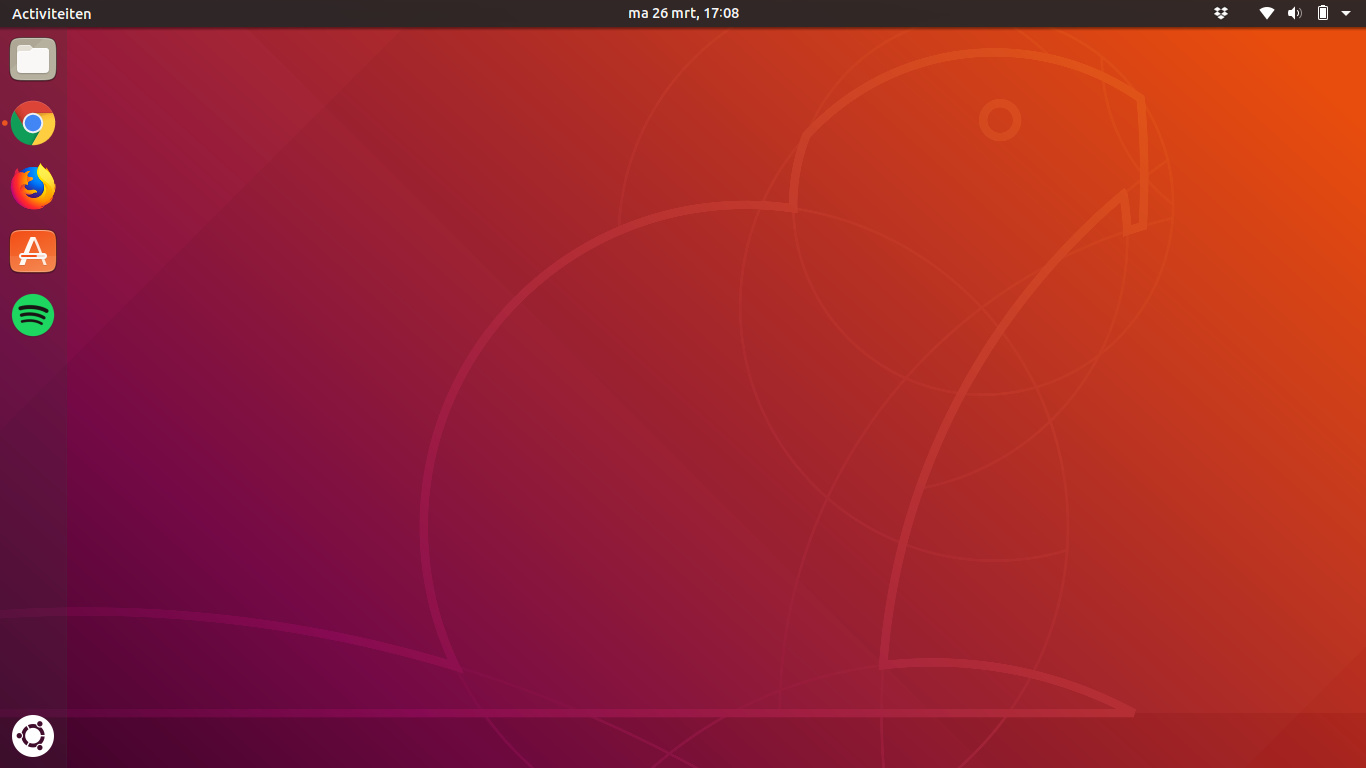
The darker top bar in the latest really looks nicer to me now.
Two suggestions:
Can we try to have Ubuntu-Dock change its background to the same opaque (new) top bar color with windows being maximized? it would possibly look leaner and simpler IMHO. Having the background shine through doesn’t make much sense with maximized windows anyway. You cannot see the rest of the background with a maximized window.
The Nautilus/Gnome-Control-Center sidebar has a gray/slightly bluish background. Maybe adding a (very) small shot of coffee/nougat would make it feel warmer/more Ubuntu? A bit of reminiscene of the old GNOME 2 Ubuntus?
Is it just me or is the “Alt+PrintScrn” keyboard combo for the screenshots borked with the latest gnome-shell? “PrintScrn” alone works as expected for me.
But communitheme will not be part of 18.04… because communitheme is not 100% ready. And releasing 18.04 with communitheme @ 99% and then polishing it up to 100% with sudo apt update && sudo apt full-upgrade apparently has been deemed impossible, because everything needs to be frozen and apparently it’s more acceptable to stay with the really old Ambiance for the next five years instead of making a few exceptions…
No problem to update Firefox during the lifetime of Ubuntu LTS. But asking for keeping the theme up-to-date seems to be too much…
There was no valid reason. At least we should try to understand what is meant by the other one. English is not my first language and thats why sometimes it is not easy to talk about something this abstract. It takes time to prepare a proposal with screenshots and gifs. And i used github many times with design-questions and we talked about it there (animations or button-design). It is not fair when it gets directly closed after a few minutes without real understanding what is meant. And i remember very good that i was told to open tickets on github when i have an idea.
So i repeat it here:
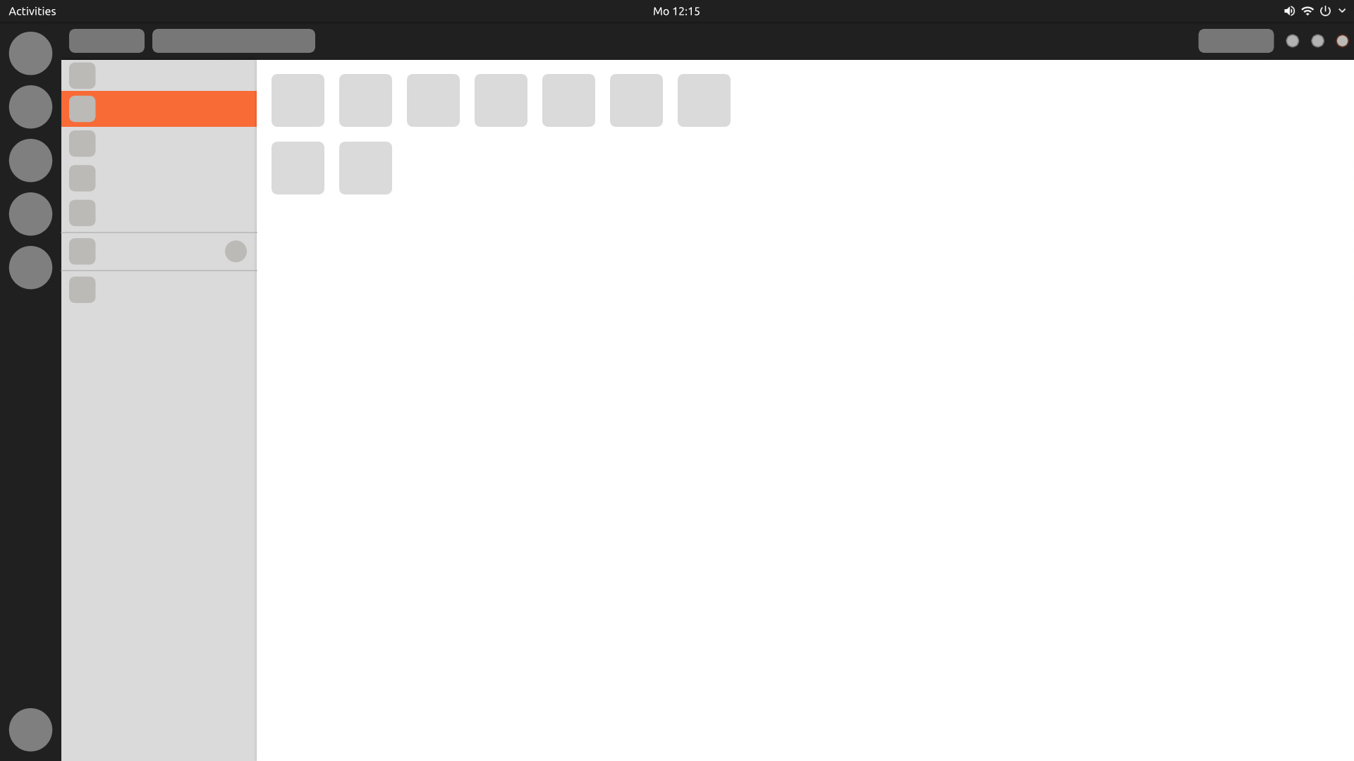
We talked a lot about the colour-choice for selected items. To be honest i am not a big fan of orange but it is going to stay. I think we should reduce the use of orange a bit. This is how the theme can look:
You can see a use of a lot of a color which is very strong on the eyes which can make the theme look immature: orange. A lot of orange.
So my suggestion is: How about changing or reducing the orange of the sidebar?
As a user I see no big difference between the different elements i can interact with. What is clickable reacts. The Buttons for example get grey:
Another reaction of a clickable element is that it gets an orange underline. See stackswitcher or when you click on activities in the top-bar.
That means we have three different looks how an element reacts when i click it:
It gets an orange background
It gets an grey(er) background
It gets an orange underline
I suggest the following:
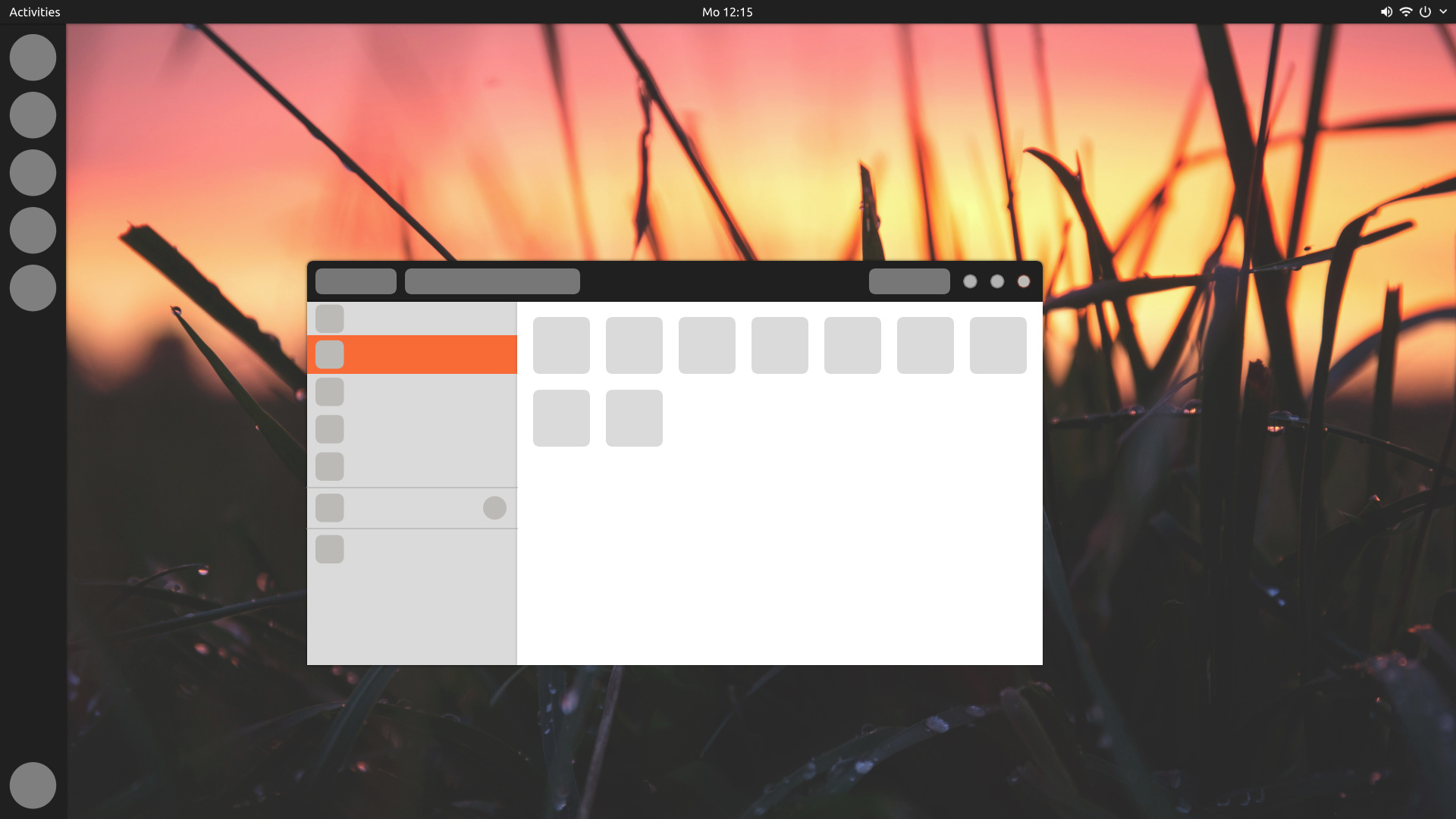
The sidebar could get a darker grey like a clickable button. This way it is clear that it is chosen and we reduced the orange.
Another idea could be:
When clicked on the sidebar it could get an orange underline. With underlines (or even vertical lines) we would keep the orange, reduce it at the same time and have a more consistent look because most elements on the theme react this way when clicked (see stackswitcher or topbar). This way we would avoid big orange chunks in the theme. My opinion is at the moment that it could look more mature by using the orange more subtle.
Hi @didrocks, not it is not a bug, but an experiment. I’m totally in favor of the 17.10 panel and dock transparency, but I didn’t like the previous very opaque one, so I tried to proposed something different. It wouldn’t feel right to me to open a bug on something I actually like
I agree @nusi, and I’m sure I’m not the only one, since you have already received some apologies.
In case you didn’t see my reply on the ticket, I’ll copy here as well:
I think there’s a little misunderstanding on orange in nautilus’ sidebar. The list item in sidebar is not just pressed, like a button, it is also selected. You can see that once pressed buttons get a orange highlight as well, so I don’t see a problem of consistency here.
In the picture you posted of a contextual menu, the label is hovered, not clicked, nor selected.
Thank you for your reply. I think i understood what you mean. The buttons get an orange edging/border, right? But they do not get fully orange. What do you think about the idea giving the nautilus-sidebar orange underlines or vertical lines? Or more like an orange border than a complete orange background. That way the color-use is not so intense.
Sidebar contains a list of items. The selected list item colour is orange. Adaiwata uses blue for selection colour, and the selected sidebar item is blue. Ambiance, like communitheme, also uses orange. Communitheme is consistent here - and the orange helps with the Ubuntu feel.
Now, I get it you don’t like orange - but that’s another matter. The theme is consistent with selected list items. And (IMVHO) it should stay as is.
Nice experiment, if I may say so! I think it gives GNOME Shell more of a recognizable Ubuntu/Unity touch. The dark, blurry top bar with the Communitheme I didn’t like that much either. On the other hand, a top bar that is too transparent (as with the default session, and in combination with the dock) doesn’t work for me either.
Needless to say, I’m a big fan of making the top bar either fully opaque, or with only a very slight hint of transparency.
On another note, @didrocks, I don’t understand why a transparent top bar is an ‘upstream desire’ we wouldn’t want to go in against, while there seems to be no problem in keeping Nautilus on 3.28, just to have desktop icons. Keeping Nautilus back one version, to me, seems to be a deliberate action that goes in against GNOME Shell design much more than a small aesthetic design feature as the colour of the top bar …
Finally, @nw9165-3201, I’m saddened by the fact that Communitheme isn’t going to be the default theme, and agree with your analysis, but it is going to be easily installable from the repositories. So, there is something to look forward to. In the meantime, Ambiance is getting some deserved love as well.
The dynamic transparency was featured heavily on the GNOME 3.26 release. The fact to have a seamless desktop by default is what GNOME design team wanted, hence this allegation. As it’s a core recognizeable mark for them on the Shell, I think we should respect and embrace that.
On Nautilus, if you read correctly my blog post about it (https://didrocks.fr/2018/01/23/welcome-to-the-ubuntu-bionic-age-nautilus-a-lts-and-desktop-icons/), it’s clearly underlined that the fact to keep 3.26 for the ubuntu LTS to keep desktop icons has the strong preference of upstream (who wrote on the blog). They understand as well that desktop icons is preferable for some user’s action. So, it’s clearly not against “upstream desire”, but a decision done working and discussing with upstream.
I have to agree with this. 17.10 looks clean, flat, simple and modern. With the solid colour the dynamic top bar is no longer dynamic too and looks old fashioned imo. It all comes down to personal taste though.
@jymmm I agree, the 17.10 shell theme is quite nice - simple and adapts to the background nicely due to transparency. Pretty much every other OS uses transparency at this point as well and it is simply expected from the end user. Also, we’ve voted on this forum to keep the transparency so I don’t know why to change it.
Well, I, personally, disagree. Look at Cinnamon, look at Budgie, Plasma, … Look even at GNOME Shell before the - very recent - change to a transparent top bar. Many taskbars have opaque colour (be it with the option to make transparent), and I would argue against your contention that it is ‘simply expected from the end user’.
Moreover, what are we going to do when we arrive at making a light theme? We either choose to only have a GTK theme, keeping the Shell them intact. This means when you maximize a window, we would have the dark (not black) top bar, with a light GTK theme.
What I would prefer more - and this is something that we have/had in Unity, and something that also exists in the United GNOME Theme - is a light Shell theme as well.
A light Shell theme would mean: dark letters on a light background. Having a transparent top bar would render the letters difficult to read when there are no maximized windows. Whereas keeping the top bar opaque doesn’t yield such a problem.
To keep things short: I’m in favour of opaque top bars OR - and this is maybe a nice middle ground solution? - a top bar with very subtle/slight transparency (like the taskbar in Windows 10 for instance).
Check out the Adwaita-Ubuntu thread, I’ve created a translucent top bar version with a white background there, works just fine @jymmm While I’d certainly like to see that, it’s rather unlikely IMHO. Adding the option would probably not be too hard, but then there would be a dependency on the top bar transparency extension or another theme version would have to be shipped - probably to much work/configuration that would have to be tested.
Considering the transparency:
Will the vote that the community did still count? It has been clearly in favor of keeping the transparency, although I don’t know about how important the votes are (CoC says it’s a meritocracy, so …)
Another option I could see looking really nice would be to use the same level of translucency for both the dock and top bar. I think this would a lot cleaner
I’m a little confused, not sure if it’s really going to change . lost truck since the move to bionic, but I want to re-vote
for transparency in top-panel . IT IS so much cleaner!
Alright, so I’ve just made some mockups with and without transparency & same dock & top-bar color. I think that this would be a nice “middle-ground” here
What it currently looks like (I don’t like it too much, “to heavy”):
 ).
). and like making mockups in GIMP, lol.


 I think it gives GNOME Shell more of a recognizable Ubuntu/Unity touch. The dark, blurry top bar with the Communitheme I didn’t like that much either. On the other hand, a top bar that is too transparent (as with the default session, and in combination with the dock) doesn’t work for me either.