Nice . I like that .

Personally, not a fan of a full orange highlight for buttons, too much distraction. A silent highlight like #000 or similar shades would be better, in my opinion
2 Likes
Inspired by the post slider here in the forum, I have trimmed the height of unhighlighted part in the buttons

I agree! The best looking is definitely the silent “highlight” (as you call it). I was merely pointing out the inconsistency of it all.
2 Likes
I do agree @feich that it looks sharper, but I believe the issue is overlapping windows. Like this:

6 Likes
This and #000 . I like #000 more though 
2 Likes
Currently, we’re using border-bottom for some selected items (like the current folder in path-bar), while these are just buttons you can click on to perform an action (or are disabled)
1 Like
The underlying (inactive) Window do not pose a problem because their colors are dimmed.
If you are having problems with hdpi screens. Increase the shade a little.
box-shadow: 0 3px 9px 0 rgba(0, 0, 0, 0.75);
And it can be useful to use #474747 instead of #363636 for inactive windows.
1 Like

Indeed. Totally awesome app button!
1 Like
It’s 0415 UK time and I’ve been playing with GIMP and Inkscape all night 
I often post feedback here, so I want to start with some positive feedback, which I don’t always remember to include.
The login screen looks gorgeous now. Also, for apps that have buttons instead of menus - e.g., the text editor - I think you’ve pretty much cracked it. I would be happy to look at those windows all day. Keep up the great work
So, here’s what I’ve been playing with and mocking up tonight.
- Mocking up a version where the launcher and top bar have exactly the same transparency, so they make a single continuous area. I thought I would hate this, but I actually love it with the right level of transparency:

- Launcher and top bar are still quite transparent until they darken on contact with windows (e.g., when you maximise). Also, for apps with menus, I’m continuing to make the titlebar, menubar and dividing line all the same colour, so they combine to make a single “stripe” at the top. I think this and the previous bullet really simplify things. Otherwise, you’re in danger of making the screen quite “busy”, with separate launcher, separate top bar, and often two separate “stripes” (title and menus) at the top of the maximised window. I think these mockups are a fresh and simple alternative:


- A more squircle-shaped - squircular? - overlay when a launcher icon is highlighted, and also some tweaks to the icons. Namely: mocking one up for the text editor, and re-using the proposed non-compass browser icon from Suru (maybe this could be used for some kind of web app - e.g., you click it and it opens the Ubuntu-branded Google search in Firefox?).


- Using the shade of aquamarine that I think @madsrh suggested for the volume slider - the more I look at this, the more I love it:

Full screen mockups:


4 Likes
I do think it should be a bit more centred on the button though.
The latest update of the Community Theme looks great!
The Ubuntu logo in the bottom left corner and the top bar color are now perfect.

5 Likes
Good screenie @TonyS - can’t wait to get home and update. Love the lack of boundary between Gnome top bar and window top bar.
3 Likes
These mockups looks very nice. How can I set the same transparency in dash and top panel?
I’ve said this before, but I honestly think it would make a huuuuuge difference if we superimposed other icons on Suru squircles. Could this be automated? I’m imagining a batch process that takes each of the non-Suru icons, shrinks it a bit, and centres it on (say) thirty-two pre-coloured squircles in different shades. Then someone simply has to pick the most pleasing one for each app.
I actually fully agree with this proposal. I fully understand the Suru icon set will not alter the branding of non-system applications, and I think that’s the correct way going forward. However, the mix of different shapes in the launcher just looks really weird and unpolished.
I think superimposing the icons on Suru squircles would make the launcher very pretty.
It appears Canonical was already doing this in Unity 8 and they basically also did it with Unity 7, putting the icons in the rounded squares.
http://www.phoronix.net/image.php?id=zesty-unity8-mir&image=ubuntu1704_unity8_6_show
4 Likes
“These mockups looks very nice. How can I set the same transparency in dash and top panel?”
@toptus011, I wish I knew how - I’m just making mockups in Inkscape and GIMP, I don’t know how to make or edit real themes.
“It appears Canonical was already doing this in Unity 8…”
@G-Force, if we go for the approach in your linked screenshot - i.e., putting 3rd party icons on the same neutral-coloured squircle - it becomes even easier, because you don’t have to worry about picking a pleasing background colour. You just have to take every non-Suru icon and centre it on a grey squircle.
Obviously, it would be better if the launcher had a “masking” feature to automatically put a squircle around icons - but, in the meantime, we can just make the icons manually. In my mockup below, I’ve stuck the Rhythmbox and Gedit icons on grey squircles. Only danger is it might start to get a bit cheerless and grey compared to the Unity Phone launcher, which had a lot of colour on it (personally, I think the text editor should be treated as a system app and get a colourful Suru icon).
@thread
Yep, Communitheme is shaping up nicely I’ve said I prefer the top bar to be transparent until you maximise a window, but that’s just a matter of personal preference, and some users will prefer what you’ve done instead.
One thing I will say is, I think it would look noticeably a lot better again (IMO less “cheesy”) without the drop shadow on the launcher:

I hope you agree, because I think flattening (“unshadowing”) the launcher really would be the finishing touch!
1 Like

This is coming
4 Likes
Communitheme is going to be a great refresh for Ubuntu, thanks for all the work put into it! I’m not even a regular Ubuntu user but I was engaged by the open discussion here and gave your theme a shot today. Its generally really pleasant to use and based on thoughtful and user-friendly decisions. I found quiet a few issues after an hour of use mainly regarding consistency. I’ll post them here first but I’m more than happy to open bug reports including screenshots if you agree. Just wanted to ask before I spam your git tracker. Keep it up!
# Communitheme-session installed 2018-1-30
*(breadcrumbs/tabbed bars not inculded as they are being reviewed and reconsidered right now; neighter is shell theme or dock as they seem unfinished to me)*
## header bars and title/menu bars
- new windows (or windows touching the top bar in generall) melt with top bar (as in maximised state)
- titles in header bars should probably be bold (or anything else) to seperate them from text buttons (see e.g. gedit; settings > info > user) (they are bold in breadcrumbs, tabbed buttons, tab interfaces, title bars)
- clickable buttons in inactive windows should have hover state (as they can be clicked; see that firefox does this for example)
- menu bars have no hover effect (should probably use the brighter white as current breadcrumbs etc)
- menu bars look different for gtk2 apps (audacity, scribus, gtkguituner, …)
- Software app misses monochrome icon (for top bar)
## window controls
- (a) hover effect (rounded square) on close button looks weird in title bars as it is hardly bigger than the circle itself. Maybe just "bolden" their lines instead of adding a background, or tone them down and lighten on hover as its currently done for breadcrumbs – they are not regular buttons anyway. (b) less height leads to smaller squares which means window controls in title bars have less spacing than in header bars. personally I would simply prefer the tighter spacing for *all* window controls. but I see that this was an intentional decision based on personal preference. Having it different for title bars and header bars seems like an issue though.
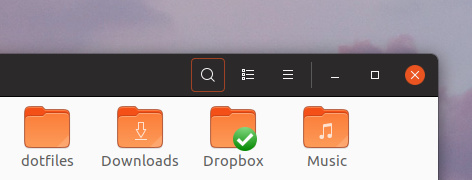
- the 'x' on the close button looks slightly uncentered (to the right) to me. (But maybe not, I can't decide.) It does also look thinner to me (maybe because it is kind of 'negative space' inside the circle or probably because it is more pixelated than the horizontal and vertical lines).
(- As a sidenote: I'm not sure the visual message of the (un)maximize button is clear. Its a small square and an even smaller square. I first thought it was a bug that it got smaller on maximize.)
## application interfaces
- tab interfaces (e.g. nautilus) look weird: border vs no border; closed buttons vs bottom-open buttons; round top corners vs sharp bottom corners; enters info bar area
- ative sidebar element (orange state) should have no hover effect as it cant be clicked anyway, it darkens the orange to be weirdly brownish and it has non on inactive windows
- sidebars look different everywhere: compare files, settings, tweaks. different hight, different spacing (none in settings, ~1px in tweaks, ~2/3px in files), different background colors (white vs grey). Probably app related.
- check mark in Software (> tab 'installed') is too thick compared to any other button icon (compare search (> tab 'all')
## sliders
- sliders look different in different states (on, off, active/inactive window, content/headerbar area) (see e.g. tweaks > add-ons): drop shadows, 1px border, size
- off sliders look inactive to me
- off or inactive sliders in headerbars look out of place (too bright) and can't easily be distinguished
3 Likes