Can I float an idea?
I think the Ubuntu application button would look great as more of a watermark on a button rather than the hard solid look it currently has .
What do people think ?
2 Likes
Yep, I think that could be less intrusive. Maybe achieved by simply introducing some opacity?

2 Likes
That looks horrible. Makes it appear as if it is just a watermark/overlay - and hides the fact that it is a button. Please don’t use this. The current black square with the white logo, whilst not perfect, is better than this.
3 Likes
@CraigD - the problem I personally have with the current black square is:
- A bit too stark/visually intrusive;
- The hover highlight is ever-so-slightly smaller than the black square, which looks a bit unfinished/untidy IMO:

Tbh I think I just like the vanilla Gnome button (3 x 3 dots) more than I like an Ubuntu logo here!
2 Likes
Okay, I’ve been having a look at the latest PPA version of the Communitheme. Here’s my latest feedback.
The shell. This might be an unpopular opinion, and I don’t want to denigrate anyone’s efforts - but I just don’t want my lovely 17.10 shell to change much.
Every time I return to it, it makes a great first impression. It feels clean, airy, and fresh. I think the 17.10 designers did a great job here. If it ain’t broke… don’t fix it? All I’d like to change is for the top bar to go a suitable (flat) shade of grey when a window is maximised.
I think I would even like to keep the standard “show apps” icon (3 x 3 dots) because it’s smart and unobtrusive, and I haven’t seen a version with the Ubuntu logo that I like better yet. But I also quite like @jasonflindt’s idea of a watermark-style logo.
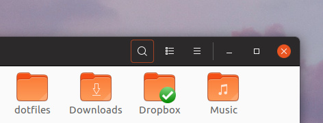
The icons. One thing I always liked about Ubuntu Phone (I actually had one!) was how colourful the launcher looked. So I was really pleased that everyone agreed to use Suru. However, the reality isn’t matching my hopes yet. Only a handful of system apps get the Suru look, and some of the most common ones (settings, terminal, files?) are monochrome.
I’ve said this before, but I honestly think it would make a huuuuuge difference if we superimposed other icons on Suru squircles. Could this be automated? I’m imagining a batch process that takes each of the non-Suru icons, shrinks it a bit, and centres it on (say) thirty-two pre-coloured squircles in different shades. Then someone simply has to pick the most pleasing one for each app.
For instance - no creative energy or thought was expended on the following mockups. The current icons were simply shrunk a bit and stuck on squircles. If I can do it, I feel like a script could?

Also, is there a reason to make common Suru icons monochrome? I feel like we can introduce a bit more colour by making the terminal and files icons mirror the default Ubuntu theming, which has purple/green/white for the terminal and orange for folder icons. Something like a more polished version of:

Of course, one man’s meat is another man’s poison, and others might feel this is gaudy. IMO it’s more in keeping with some of the other Suru icons.
4 Likes

Can’t we use border-bottom here as well ?

Personally, I am all in for keeping breadcrumbs with a single element style. Keep it simple, please.
a sharper image can be obtained if the effect of 1px box shadow in window decoration is removed.
box-shadow: 0 3px 9px 1px rgba(0, 0, 0, 0.5), 0 0 0 1px rgba(0, 0, 0, 0.23);
to
box-shadow: 0 3px 9px 0 rgba(0, 0, 0, 0.5);

or a new color is needed between the shadow and the title bar.
2 Likes
Nice . I like that .

Personally, not a fan of a full orange highlight for buttons, too much distraction. A silent highlight like #000 or similar shades would be better, in my opinion
2 Likes
Inspired by the post slider here in the forum, I have trimmed the height of unhighlighted part in the buttons

I agree! The best looking is definitely the silent “highlight” (as you call it). I was merely pointing out the inconsistency of it all.
2 Likes
I do agree @feich that it looks sharper, but I believe the issue is overlapping windows. Like this:

6 Likes
This and #000 . I like #000 more though 
2 Likes
Currently, we’re using border-bottom for some selected items (like the current folder in path-bar), while these are just buttons you can click on to perform an action (or are disabled)
1 Like
The underlying (inactive) Window do not pose a problem because their colors are dimmed.
If you are having problems with hdpi screens. Increase the shade a little.
box-shadow: 0 3px 9px 0 rgba(0, 0, 0, 0.75);
And it can be useful to use #474747 instead of #363636 for inactive windows.
1 Like

Indeed. Totally awesome app button!
1 Like
It’s 0415 UK time and I’ve been playing with GIMP and Inkscape all night 
I often post feedback here, so I want to start with some positive feedback, which I don’t always remember to include.
The login screen looks gorgeous now. Also, for apps that have buttons instead of menus - e.g., the text editor - I think you’ve pretty much cracked it. I would be happy to look at those windows all day. Keep up the great work
So, here’s what I’ve been playing with and mocking up tonight.
- Mocking up a version where the launcher and top bar have exactly the same transparency, so they make a single continuous area. I thought I would hate this, but I actually love it with the right level of transparency:

- Launcher and top bar are still quite transparent until they darken on contact with windows (e.g., when you maximise). Also, for apps with menus, I’m continuing to make the titlebar, menubar and dividing line all the same colour, so they combine to make a single “stripe” at the top. I think this and the previous bullet really simplify things. Otherwise, you’re in danger of making the screen quite “busy”, with separate launcher, separate top bar, and often two separate “stripes” (title and menus) at the top of the maximised window. I think these mockups are a fresh and simple alternative:


- A more squircle-shaped - squircular? - overlay when a launcher icon is highlighted, and also some tweaks to the icons. Namely: mocking one up for the text editor, and re-using the proposed non-compass browser icon from Suru (maybe this could be used for some kind of web app - e.g., you click it and it opens the Ubuntu-branded Google search in Firefox?).


- Using the shade of aquamarine that I think @madsrh suggested for the volume slider - the more I look at this, the more I love it:

Full screen mockups:


4 Likes
I do think it should be a bit more centred on the button though.
